Dashboard
With a dashboard, different graphs can be displayed on the same screen. Different graphs, such as line graphs and digit graphs can be used to display resource data, so that you can view monitoring data comprehensively.
You can add key resource metrics to a dashboard and monitor them in real time. You can also compare the same metric of different resources on one screen. In addition, by adding routine O&M metrics to a dashboard, you can perform routine checks without re-selecting metrics when you open AOM again.
Before creating a dashboard, learn the types of graphs that can be added to a dashboard for accurate resource monitoring. The following graphs can be added to a dashboard:
Metric Data Graphs (Including Line and Digit Graphs)
Line graph: displays the metric data trend by time. Use this type of graph to monitor the metric data trend of one or more resources in a period. Titles of metric data graphs can be customized.
You can use a line graph to compare the same metric of different resources. The following figure shows the CPU usage of different hosts.
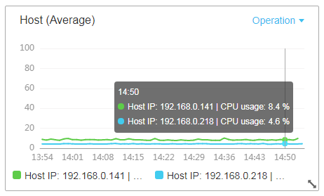
Figure 1 Line graph
Digit graph: displays the latest value of a metric in real time.
The following figure shows the latest CPU usage.
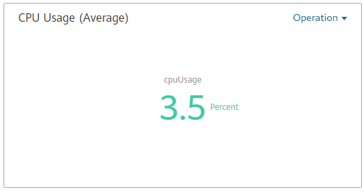
Figure 2 Digit graph
Health Status Graphs (Including Threshold, Host, and Service Status Graphs)
The statuses of thresholds, hosts, and components can be displayed. The statuses of one or more threshold rules, hosts, or components can be added in one graph for monitoring. Titles of health status graphs can be customized.
Threshold-crossing status graph: monitors the status of alarm rules in real time.
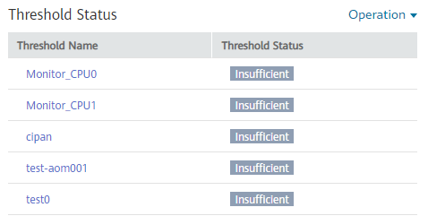
Figure 3 Threshold-crossing status graph
Note
Before adding a threshold-crossing status graph, create a threshold rule. Otherwise, the threshold-crossing status graph cannot be added.
Host status graph: monitors the health status of hosts in real time.
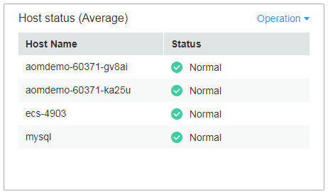
Figure 4 Host status graph
Service status graph: monitors the service status in real time.
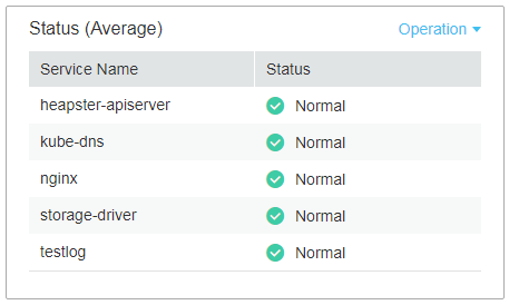
Figure 5 Service status graph
Precautions
A maximum of 50 dashboards can be created in a region.
A maximum of 20 graphs can be added to a dashboard.
A maximum of 100 resources can be added to a line graph, and resources can be selected across clusters.
Only one resource can be added to a digit graph.
A maximum of ten threshold rules can be added to a threshold-crossing status graph.
A maximum of ten hosts can be added to a host status graph.
A maximum of ten components can be added to a component status graph.
Creating a Dashboard
Log in to the management console.
Under Application, click Application Operations Management.
In the navigation pane, choose View Management > Dashboard.
On the Dashboard page, click Create Dashboard. In the displayed dialog box, enter a dashboard name and click OK.
Add a metric graph to the dashboard.
Note
Before adding a threshold-crossing status graph, create a threshold rule. Otherwise, the graph cannot be added.
The following shows how to add a line graph to a dashboard:
On the Dashboard page, click Add Metric Graph. In the displayed Select Which to Add dialog box, click Create below Metric Data.
Select the type of the graph: In the displayed Add Metric Graph dialog box, select Line graph and then click Next.
Select the metrics and set Statistic Method and Statistical Cycle, and click OK.
Click Save in the upper right corner of the Dashboard page.
Note
The Auto Refresh (
 ) option in the upper right corner of the Dashboard page can be enabled to automatically refresh all graphs in the dashboard.
On (default)
Data in the dashboard is automatically refreshed every minute.
Off
Data in the dashboard is not automatically refreshed.
More Operations
After creating a dashboard, you can also perform the operations described in Table 1.
Operation Object | Operation | Description |
|---|---|---|
Dashboard | Set an interpolation mode | For details, see Table 2. |
Save as | Click More in the upper right corner of the Dashboard page, and choose Save As, Rename, or Delete from the drop-down list. | |
Rename | ||
Delete | ||
Export a monitoring report | Click Export Monitoring Report to export only line graphs in the dashboard as CSV files to a local PC. | |
Metric graph | Add | Click Add Metric Graph to add a line graph, digit graph, threshold-crossing status graph, host status graph, or service status graph to the dashboard. |
Modify | Choose Modify Copy, Delete, or View Larger (support only for line graphs) from the Operation drop-down list. 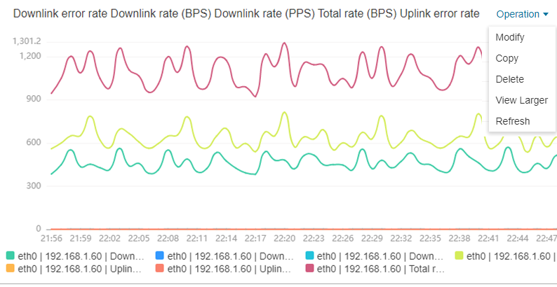 Figure 6 Metric graph¶ Note In a dashboard, when resources such as hosts and services are deleted, metric graphs created for these resources are not automatically deleted. To improve system performance, manually delete unnecessary graphs. | |
Copy | ||
Delete | ||
Zoom in | ||
Refresh | ||
Resize | Hover over the lower right corner of a metric graph. When the cursor changes to | |
Reposition | Hover over the blank area in the upper or lower part of a graph, and drag and drop it to the desired position. |
 , hold down your left mouse button to resize the graph.